
Recent Projects
Pink Lady House
LOCATION: WISCONSIN, USA
DATE OF COMPLETION: NOVEMBER 30, 2023
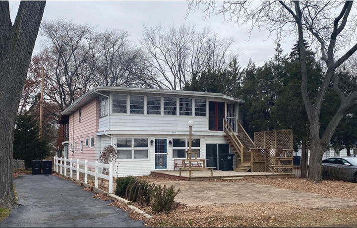
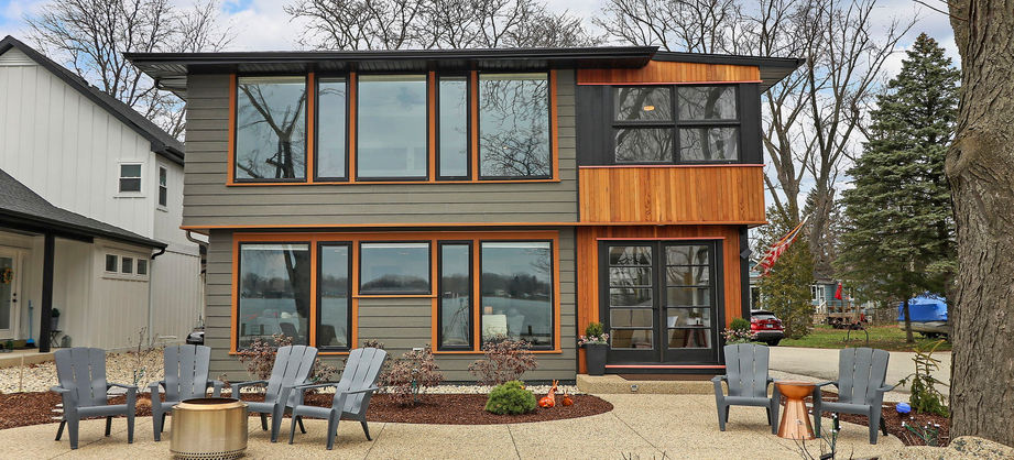
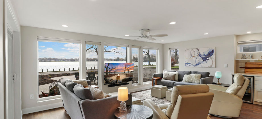
Discover how we revitalized a 1950s home, affectionately named "The Pink Lady," by transforming its disjointed layout into a modern, open living space. Our innovative approach maximized lake views and honored the home's midcentury roots while incorporating contemporary design elements. Read or listen to the full story below to see how we brought this midcentury gem into the modern day or skip to the photo gallery to see the before and after photos.
From Modern 1950’s to Modern Day
Built sometime in the 1950’s, The Pink Lady (as we affectionately named this house), offered us an opportunity update this midcentury house.
Initially, the clients asked us for a simple floor plan to just make a few updates to the interior. After a site visit, we felt this house had a lot of untapped potential; there was so much misused space. The house had undoubtedly gone through many additions with no regard to flow. It seemed to have been used as a duplex with a separate kitchen on the second floor, and most of the rooms were compartmentalized. There was a considerable amount of wasted square footage that could have a substantial potential if reworked. But more importantly, there were glimmers of what could be buried in this design.
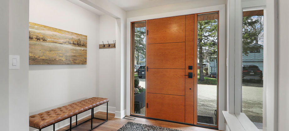
We approached the house design with “an anything goes” attitude. We removed walls, removed entire rooms, we cannibalized old porches, and even changed the front and back door locations. We presented the clients an open floor plan design based around modern living style while maximizing the lake views available to us. We were very fortunate to have clients that put their trust in our ideas and the possibilities to make it better.
Fix the Flow
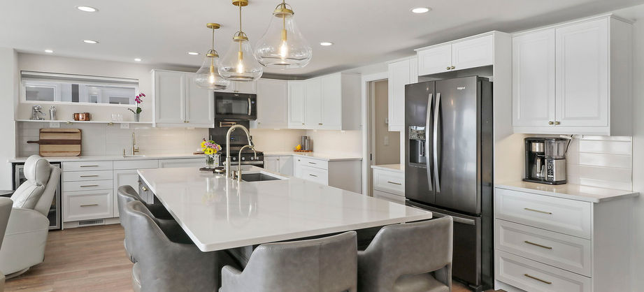
Upon first glance at this house, there was one aspect of the design that we knew could be its downfall or success: fixing the flow! We needed to reorganize the space given to us to bring this house to its full potential, without adding any additional square footage. We started by removing anything that seemed unnecessary or that was taking up space which could be used elsewhere. (Goodbye, second kitchen!) We focused our biggest efforts on the first living areas: taking down walls to open the space and views to the lake; these changes made a drastic difference. This gave us the opportunity to create an open first floor with a modern kitchen and living space looking over the lake, and a private second floor with multiple large bedrooms and a master suite with the best lake view in the house.
This idea of flow was also taken to the exterior of the house. Originally, due to the multiple additions that it had gone through, the exterior was presented with a variety of finishes and colors. The house was frankly, a disaster. However, with a trained eye and lot of imagination, we saw the glimmer of what could be.
The clients initially did not have high hopes for this house. As we mentioned earlier, they had just asked for an interior floor plan. They knew they had purchased a project that needed a lot of help, but they were not thinking of reinventing the house. We’re not sure if didn’t see its potential or if they were just focused on other projects at the time.
We saw the exterior as the ultimate blank slate; a large, ambiguous box of a house. It had subtle nods to modernism (jalouse windows, low pitched roofs, and couple of interesting midcentury modern doors). However, the characteristics began and ended with these features. As modern architects, these types of renovation projects are exciting. We’re provided with a kit of parts and we need to reassemble these various features to make something new. The challenge is always interesting because we have to work with what’s there while simultaneously reimagining it.
For the exterior we kept the low roof pitches and embraced the long horizontal lines. We see elements of the Prairie Style present in the roof. The overall massing was also retained, however, we broke up the massing through materiality. Most prominently, we wrapped the lakeside corner in reclaimed cedar and we wrapped the corner windows in black trim. We added an additional fun trim detail at this area too (more on that below).
The Evolution
This project was a working process evolution for our firm. And the project, really benefited from this change. Prior to this project, we only hand rendered our designs.
Hand rendering has a lot of benefits. Primarily, it puts the focus on the overall design. Because we’re not looking at the color of the siding, the roof, windows, etc. We can view the project holistically and make decisions on the architecture. We then take this design through the architectural process. Designs get approved, construction documents are developed, permits are granted, and construction begins!
On many projects, the client then works with the builder to select the final finishes. What colors with the windows and siding and roof be? At this juncture, the architect isn’t always in the picture (in our practice, we were not). The downside is obvious, the architect created the design and can be pretty useful helping select the colors and final details. The burning question, why not keep in the architect involved? It sadly comes to down to money. The building process is very expensive and most clients try to get to the built product without spending anymore than they deem necessary. It’s just color, right?
A quick side bar, the devil is in the details. Yes, you need to start with a good design. But, to go from good to great, you need to nail the details.
So – back to these wonderful clients. They saw the potential upside to keeping the architect engaged. After the construction drawings were complete, they asked, can you create renderings with color concepts? Truth be told, this used to be very difficult and time consuming. However, with new rendering software, it’s become less time intensive.
Our evolution – we generated 6 or 7 different color schemes. While developing the schemes, we revisited many of the trim details and designed them to mesh with the materials chosen. The final trim details along with the material design selections, really made this house what it is.
Nod to the Past with Thoughts of the Future
When it comes to a renovation, keeping the character of what came before can be a great way of showcasing the changes in architecture over the years while adding to the design of the home. What used to be considered modern is vastly different to what modern is today. This concept can be seen in the final design of The Pink Lady. For the interior floor plan, there were certain elements that could not be moved which we needed to work around. In this case, it was the stairs. The existing stairs did not meet current building code. The steps were a bit too shallow. If we wanted to move the stairs, we would need to bring them up to code which would have negatively impacted the floor plan as the stairs would need to grow in size. We were lucky that the location of the stairs worked well for our designs. By keeping the stairs in place, with some updates to the appearance, we were able to keep an aspect of the floor plan that worked and were able to save space and construction cost. For the exterior, we were able to repurpose some elements which inherently also cut the cost of some materials. We relocated the old single pane jalouse windows to the 3-season room. These windows were a nod to the modernism of the 1950s and their lack of energy efficiency didn’t matter for the 3-season room. Perhaps the most impactful reuse was the original cedar decking boards that were repurposed as new vertical siding for the front corner of the house. The decking boards had many layers of varnish and stain that needed to be removed. However, after planning these old boards down, we were left with beautiful old growth cedar.
The final nod to the past was the touch of pink. We named the house “the Pink Lady” because a couple walls of the house was clad in a light pink aluminum siding (think Miami). All along, we thought, this pink house has stood on this corner for the last 70+ years. Do we want to full eradicate its existence? As a nod to the past, we thin strips of pink trim at our cedar corner of the house. If you look closely, you will notice horizontal strips of pink trim at the heads and sills of the doors and windows. The pink contrasts against the black trim while nicely complementing the cedar siding.
The next time, you drive through an old neighborhood and you see a bold house of a bygone era or in this case a wreck of a house of a bygone era, give us a call. Not all is lost. There is potential under there!


